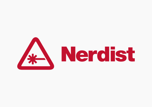
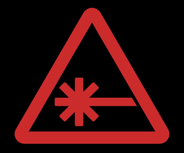
During the 49th Super Bowl last night, we saw many a sweet commercial. From Liam Neeson getting revenge on a phone game to, well, kids dying, we saw it all. What we didn’t expect to see was our own logo showing up in an ad for US Bank. Towards the end of the game, actually just after the now infamous finish, US Bank presented a commercial showing a company getting more competition in a changing space. If you were paying attention you may have noticed the logo for “Stable Industries” looks mighty familiar. Watch the commercial below to see if you notice US Bank lifting Nerdist’s logo.
That does look like a familiar font and laser warning. We weren’t aware of US Bank’s admiration, but we’re looking forward to finding out if the graphic designer on staff is a Nerdist fan. Judging by the font on that “Trans Rational” logo, they’re also a fan of Transformers. The commercial was made by Butler, Shine, Stern and Partners.
[UPDATE: The folks at BSSP say it’s all just a merry coincidence and that neither the “Stable Industries”or “Trans Rational” logos are based on any properties they liked in the past. So no conspiracy at play, but that is definitely the Transformers font.]
Below check out our logo and its inspired clone.
What do you think? Was this our backdoor debut at the “Big Game”? Let us know your conspiracy theories in the comments below.


sometimes a cigar is just a cigar. Unless it’s a penis.
Ahh, now I see why I was thinking, “boy those logos look awfully familiar!”
obsessing over subliminal pyramid style logo’s in advertising eh, nerdist?
Consssssspiracyyyyyyyyyyyy!!!!
It’s hard to see without Chris’ 80″ TV…
It’s crystal clear if you watch on Frank’s 2000″ TV.
Methinks someone has an overactive imagination.
Haha, that’s definitely very similar! On a side note, I like how the woman’s poor diction makes it sound like she’s saying, “I’m calling you a spank” instead of, “I’m calling US Bank” :- p.
Sincerely, A gradeschooler :- p
That had has been airing for a couple of weeks.
“ad”
Uhm… no, I’m not seeing it…